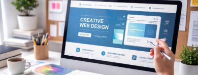
Content-First Design: Prioritizing Quality Content in Your Web Design
Content defines how the layout and visuals take form. This method starts with defining the type, tone, and purpose of content before layout decisions are made. When text, media, and headings guide choices, the result is a blogspot layout that supports readability and user flow. Visual elements such as spacing, typography, and navigation are shaped by real content, not placeholders.
Why Blog Design Matters: The Impact on User Experience and Engagement
The structure of a blog affects how readers navigate and respond to information. Layout, typography, and visual balance affect readability, time on page, and navigation clarity. Logical visual flow makes content easier to process. Quick access to desired content encourages people to browse further or revisit later.
Design also shapes perception. A cluttered or inconsistent interface can undermine credibility, while a clean and intuitive one builds trust and supports deeper engagement. Blog design – this is how you can boost your online visibility and drive organic traffic from Google.
How Blog Design Differs from Website Design
While websites often prioritize navigation, conversions, or product structure, blog design focuses on clarity, flow, and sustained reading. The focus moves from interaction to understanding the content. Blogs require layouts that support scrolling, readability, and content hierarchy. Repeated elements like post previews, author bios, and related links must stay accessible without overwhelming the user. Unlike static web pages, blog posts’ design adapts to frequent content updates.
Expert Blog Design Tips for Enhancing Engagement
Engaging blog style relies on the structure that encourages interaction without distraction. Clear headings, short paragraphs, and logical flow help retain attention across diverse devices.
Optimize Your Blog Design for Readability
Well-balanced typography, spacing, and structure make reading easier. Headings and visual breaks improve scanning. Color contrast should support clarity across all devices. You can do it yourself or with a Digital Marketing Agency.
Maintain a Consistent Design
Unified blog styles across fonts, colors, and layout elements build trust and recognition. Inconsistencies distract and weaken perception. A stable structure helps each post align visually.
Prioritize Mobile-First Design
Creating for mobile ensures accessibility and smooth navigation. Adaptive blog layouts with mobile-friendly features improve the browsing experience. On smaller screens, primary content should remain easy to read and navigate.
Ensure a User-Friendly and Easy-to-Navigate Blog Layout
A logical layout of a blog supports faster orientation. Clear menus, structured sections, and familiar patterns for the blog as sticky headers improve flow. Simplicity helps users stay focused.
Create a Clear Visual Hierarchy for Blog Layouts
Hierarchy shapes attention and supports content flow. Headings, spacing, and placement help readers process information naturally. Structure matters more than decoration.
Top Blogging Platforms with Excellent Design Options
Different platforms offer varying levels of flexibility, layout of blog control, and theme variety. Choosing the right one depends on your content needs, visual preferences, and technical comfort.
WordPress
Pros:
- A large variety of themes and plugins
- High customization potential
- Wide community support
Cons:
- Can require regular maintenance
- Plugin conflicts may occur
- More complex for beginners without guidance
Ghost
Pros:
- Clean, content-focused design of a blog
- Fast loading and lightweight
- Simple, distraction-free interface
Cons:
- Fewer themes and integrations
- Limited flexibility for non-publishing use
- Requires technical setup for self-hosting
3 blog design examples
Reviewing blog layout examples helps identify patterns in structure, content flow, and visual hierarchy
First example
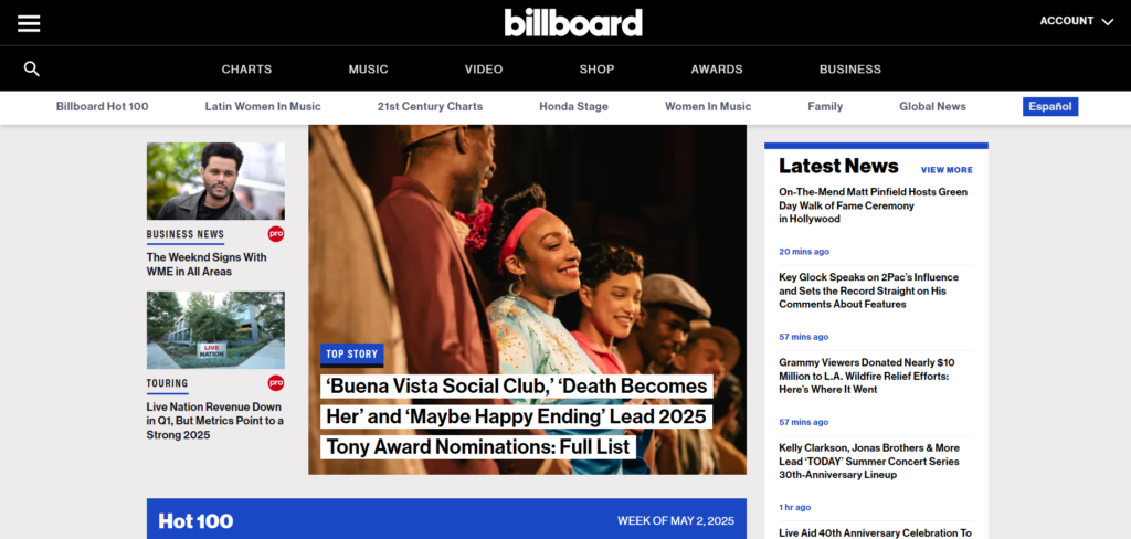
- Billboard’s blog reflects the priorities of a fast-paced entertainment news platform. Its layout mimics a digital magazine, emphasizing immediacy, headlines, and visual content to engage readers seeking music and pop culture updates.
- The design of blogs prioritizes high-frequency updates, bold imagery, and category segmentation.
- User experience is driven by variety and accessibility. The homepage offers multiple entry points, from trending charts to breaking news, catering to different content preferences. Despite the density, the visual grid and color blocks provide structure and guide attention.
- Mobile and desktop blog post layouts retain content hierarchy but differ in spacing and visibility. This ensures mobile responsiveness through stacked elements and condensed navigation, making the blog accessible across devices without losing functional clarity.
Second
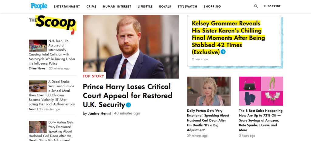
- People’s blog embraces a tabloid-inspired visual language tailored for entertainment-first audiences. The layout emphasizes celebrity-driven headlines, eye-catching visuals, and emotional storytelling. It appeals to readers looking for lifestyle, pop culture, and human interest stories in a high-contrast, fast-scanning format.
- The style relies on color accents, dense visual blocks, and bold typography. Sections like “The Scoop” and “Top Story” are marked and rely on large images paired with oversized headlines. Highlighted text, such as neon yellow callouts, draws attention to trending or provocative topics.
- Engagement is supported through visual hierarchy and immediate accessibility. Users are presented with multiple headlines at once, reducing the need for deep scrolling. The modular card-style layout allows for quick scanning, which suits the platform’s frequently updated content strategy.
- Mobile and desktop layouts prioritize visual density over whitespace. The mobile version retains bold formatting but simplifies structure to keep load times fast and navigation intuitive. Each element is adapted for vertical viewing without losing its energetic, media-heavy tone.
Third
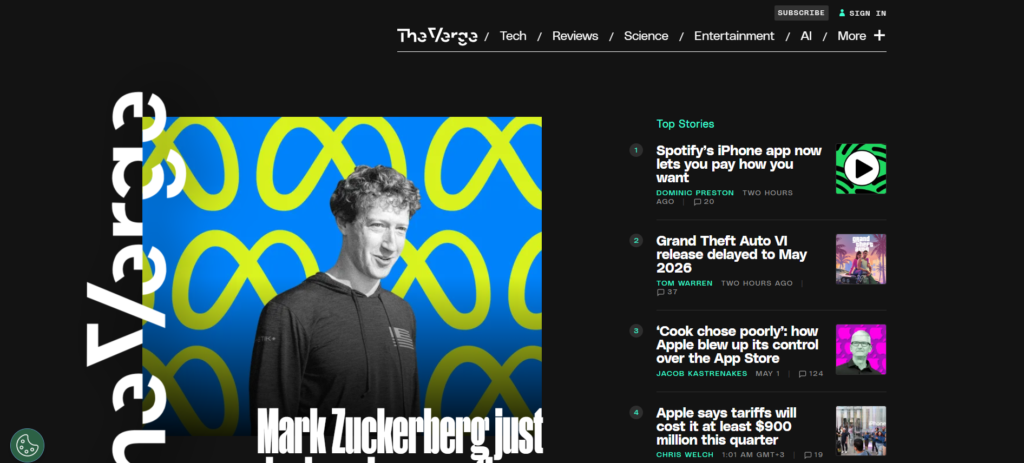
- The Verge’s good design blogs reflect its identity as a tech-forward publication. The layout merges bold editorial visuals with experimental typography, aimed at readers interested in technology, culture, and futurism. It captures attention immediately through dramatic contrasts and asymmetrical structure.
- The visual language is immersive and distinctive. The sideways logo, oversized headlines, and vibrant imagery signal a break from conventional media layouts. The dark background enhances visual contrast and creates a cinematic feel, reinforcing the platform’s high-concept tone.
- Content is structured to highlight both depth and urgency. The homepage balances a strong hero feature with a compact list of trending stories. Despite the dense content, visual spacing and color accents maintain clarity.
- The mobile experience preserves visual impact without sacrificing readability. Typography scales responsively, while layout shifts prioritize vertical flow. The Verge manages to retain its graphic intensity even on smaller screens, without overwhelming the user.
Unlike standard websites, blogs focus on readability, mobile adaptability, and ongoing content updates, making structure and tone more important than static visuals. Best practices include logical layout, mobile-first thinking, and maintaining visual harmony across elements. Readability, user orientation, and flexible platforms like WordPress or Ghost shape the reader’s experience and influence perception.